With Gentle Touch & Painful Grip: Andy Warhol at Neue Nationalgalerie
What insights can another Andy Warhol (1928-1987, American) show offer that aren’t already covered? Neue Nationalgalerie focuses on the dynamics of intimacy.
The exhibition title leans on Alan Downs’s (Gen X, American) book The Velvet Rage (2005) about growing up gay in a heteronormative society. Curators Klaus Biesenbach (Gen X, German) and Lisa Botti (Millennial, German) brought together works that deal with Andy’s search for beauty, intimacy, and vulnerability. Many works are less known as they were heavily censored during Andy’s lifetime. They were brought together “for the first and hopefully not for the last time”, the introductory text concludes. Shivers.
The show starts with Andy’s drawings on paper from the early ‘50s. They’re tender depictions of male bodies, stolen kisses and glances in between. The curved lines shaping Jon Gould’s (a love interest of Andy’s) torso in a 1985 drawing look so art nouveau-coded. There’s so much romance. Andy used a lot of gold leaf in the ‘50s. He turns torsos and heads into fragments of shiny statues. Maybe even Orthodox saints. I see where Harold Stevenson (1929-2018, American) got that from…
Some drawings feel uncanny: Male Heads (1953) is neatly divided into darkness on the left and a white silhouette crowd on the right. Who are those creepily grinning men? One of them spots two men kissing in the distance, their shape turning into a heart. Is he gonna tell on them? And then there’s Kiss (1953). Five male couples make out while one person looks up at the endless void unfolding on paper. Another drawing from 1953 shows a man lying on the ground. Are the people to the left rushing to help or making sure they knocked him out? It’s hard to tell who’s safe to be around in these pictures and who’s not. Fitting for a time when secrecy was not about adventurous excitement but a question of safety.

Book-Tok Level Spice
Best believe not all works are as dreamy as the early drawings. The film Blow Job (1964) is exactly what you think it is. The camera is focused on a man receiving. His eyes shutter, he throws back his head occasionally. Though some of his expressions look rather annoyed than pleasured to be fair. The curators hung the film close to the ceiling, resulting in an awkward tension as I looked up and involuntarily locked eyes whenever he looked down. The curators really went that extra mile to make it unmistakable.
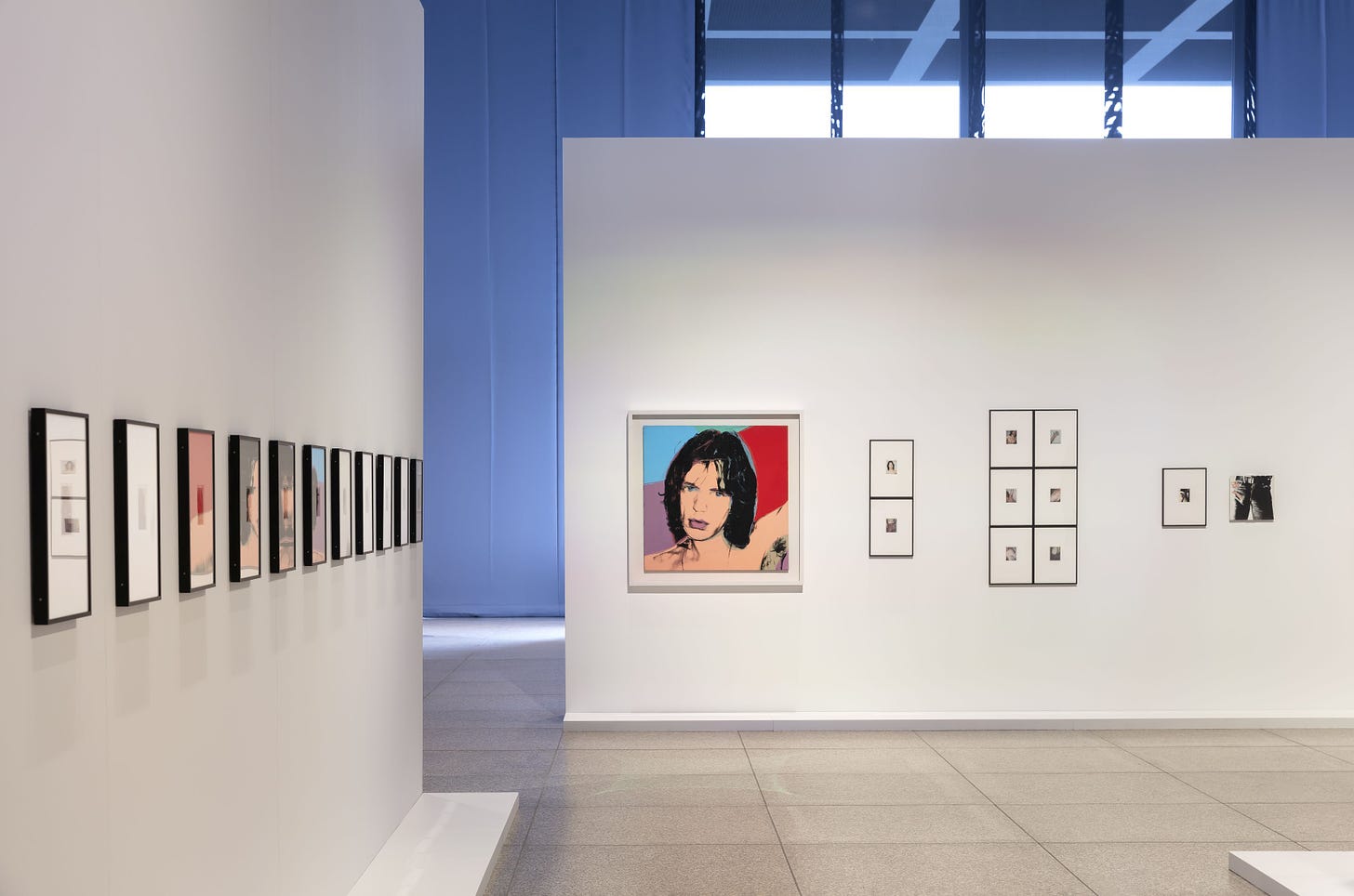
Many works are called Torso here. And although the torso is the upper part of the body without limbs, the music plays downstairs for Andy. Instead of leaning into the classical antique imagery of naked athletic male bodies, in the ‘70s, Andy took many Polaroids of his models from the waist down wearing jeans. Also instead of shrinking “the package” as appropriate for antique sculptures, Andy brings attention to the bulges underneath the thick denim fabric. Speaking of antiquity:
Sexy allusions continue with photographs of marble wrestlers that Andy took in the Louvre during his visit to Paris in 1977. From Andy’s close-up angle, those fighters look more like they’re wrestling in the sheets. Klaus and Lisa used the building’s beautiful green marble columns to display these gems. And speaking of absolute gems:
I sincerely thank the curators for introducing me to Jed Johnson (1948-96, American). Jed didn’t like being photographed, but his boyfriend Andy managed to snap the shot of the century with Jed Johnson in a bathtub (1985): Jed reclines in a bathtub, only his knee and head from the chest upwards peeking out the foamy water, leaving everything else to the imagination. He turns his face to Andy as if saying something (maybe asking to put that damn camera away?), looking up with raised eyebrows and his mouth slightly opened. This man had absolutely no business being this fine. I’m not saying I’m obsessed, but I do say that I have a new lock screen.
When More is a Bit Too Much
Curatorially, I see how the building is quite a challenge. I find not using the natural light from the glass facade a shame, but I don’t know how one could have done it differently while accommodating over 300 works, considering that the drawings among those are probably highly sensitive to light exposure.
Actually, there were some pieces that I found to be out of place. Like the Hammer and Sickle (1976) Polaroids. Everything before that tied in neatly into the overarching theme of intimacy and fragility and then BOOM: communism. And there was no explanation either. Is this supposed to be a sexual metaphor? A lil explanatory text would have hurt nobody.
The same goes for the film Empire (1964) documenting the Empire State Building by night for eight hours straight. It’s hung high similarly to the blowjob film, but this time, there’s no fun connection except for “tall building means film must be up”. And there’s no explanation as to how this film fits into the exploration of intimacy, the label only mentions that it’s about the passing of time and that the building received floodlight in 1964. Is this just another Freud thing? Big building = big dick? That doesn’t sound plausible. Klaus wrote in the catalog preface that “[t]he building’s prominence motivated Warhol to take its portrait like a star, like a person.”1 If that’s a personal interpretation (he doesn’t back it with sources), I find it a bit far-fetched. How are people supposed to come to that conclusion on their own?
Finally, the iconic Double Elvis (1963). I guess you can say that Elvis represents 1960s beauty standards, okay. But what else can this enormous portrait show us in the context of this exact exhibition? The macho Elvis piece hangs right next to the sensual portrait of fellow artist and collaborator Jean-Michel Basquiat (1960-88, American) posing as Michelangelo’s David (1501–04). Now that I think about it, maybe those are exactly the two worlds that collided in Andy: The straight societal framework and queer identity finding its way through.

Power Struggles
Downstairs is reserved for Andy’s black and white film portraits of men, his so-called Screen Tests. You can sit down on school benches to watch those. I don’t know what roleplay fantasy we’re getting into here, a bit out of pocket to be honest.
Sometimes these men perform erotic gestures such as sucking a finger, in other films, they just look at the camera. I’m now convinced that Chris Pine is the reincarnation of George Millaway (1964). It’s giving fainting over your crush no matter what they do. This obsessive energy is even more present in Couch (1964): A fully clothed man observes his shirtless sleeping beauty on a couch. The observer’s black leather jacket and the light pants of the observed suggest a sort of yin-yang contrast, light passivity versus dark activity. It reproduces straight gender dynamics of a passive female and an active male partner.
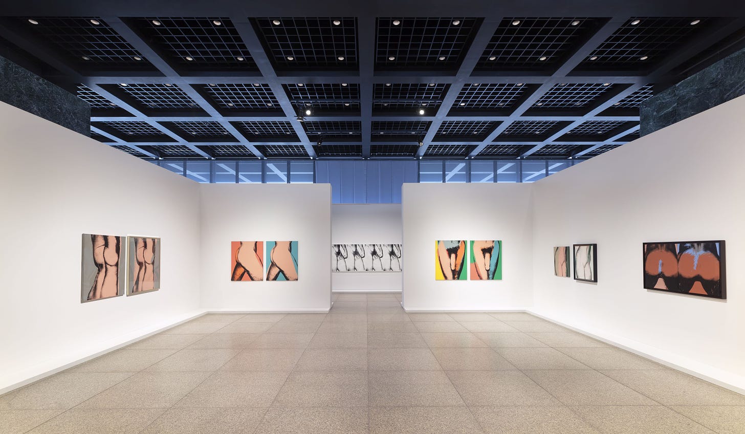
Andy often pulls bodies into pieces. I’m reminded of Laura Mulvey’s theory on the cinematic (straight) male gaze: The person isn’t seen as an entire human being but as separate desired and sexualized body parts. Andy fragments bodies by collaging them out of Polaroids as with the Portrait of Jean-Michel Basquiat as David (1984). The ‘70s Sex Part series is the rawest form in the show: Penis close-ups, sometimes in the middle of sex. Call me unserious, but the spread cheeks of the Male Buttocks series are not giving as much sex as they are corporate ass-cheeks-on-a-printer-humor.
Sexualization even takes on a violent form: The 1982 and ‘83 Polaroids in preparation for the Querelle (1982) movie poster design allude to violence. I felt it but I couldn’t put my finger on how exactly a man’s tongue teasing another one’s ear is unsettling. The text mentioned his sharp tongue, it really resembles that of a dragon or a blade. And the other young man isn’t reciprocating as if he’s resisting the seduction. Desire can be destructive.
Looking at the upside-down silkscreen torsos from 1977, I kept thinking of Francis Bacon’s (1902-92, British) hanging butcher meat paintings. Andy turned Muhammad Ali’s fist in the 1978 screenprint crimson red. The label argues that it’s a reference to “queer culture”, but I can’t shrug off the connection between sexual and physical violence. Most obviously, I found it in the five-meter-long black-and-white work Torso (1977). A closed fist next to the penis of the sitter suggests escalation. Although the show argues in favor of Andy’s more vulnerable side, I see a lot of flirtation with macho violence.
Andy’s Take on Beauty
I value the transparency with which the curators approach Andy’s legacy. In the label corresponding to his drag self-portraits on Polaroid, they say that when they first started their research, that initial “version of the show would have focused primarily on the splits and contradictions in the artist’s personality. The main challenge there would have been shining a light on Warhol’s intimate, fragile side while also revealing moments when he was driven, aggressive, and thoroughly aware of his power.”
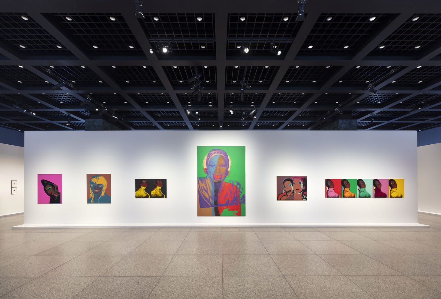
This show isn’t desperately trying to convey that Andy was a really nice guy underneath his aloof persona, while still conveying how delicate and gentle he approached depicting certain people and aspects of intimacy. The exhibition acknowledges that he was a tricky figure. Even while working on the Ladies and Gentlemen series which portrays New York’s drag and trans community, the label mentions that artist Glenn Ligon (Baby Boomer, American) “claims that the models were exploited and have not received their fair share of the profits from these works.”

Andy wasn’t exactly the type of person who cared exclusively about the soul's content. He gave good looks a lot of value and didn’t hide that. Whenever I have some spare time, I love reading an entry or two in Andy’s diary. He had mad storytelling skills and unhinged takes. Though sometimes, he was way out of pocket with his occasional fatphobic or sexist remarks. As much as he has never met a person he couldn’t call a beauty in his own words2, he also had no issue with pointing out people’s aesthetic flaws.
Yeah, Andy canceled the film project The Beauties because he couldn’t decide who should be in it. But it was because he didn’t want to offend anyone who starred in his other movies by not picking them,3 not because he was a fierce advocate of “all bodies are beautiful”. As far as I see it, he was more the type of person to say “You can be beautiful even if X or Y is wrong with you” rather than a representative of what we’d call today “radical body positivity”. Just something to keep in mind while observing Andy’s search for beauty.
Andy Warhol: Velvet Rage and Beauty, through October 6, 2024
Neue Nationalgalerie
Potsdamer Straße 50
10785 Berlin
Website
Instagram: @neuenationalgalerie
I hope you enjoyed this review and my perspective on Andy’s work. If you did, I’d be happy if you subscribed and left me a like and a comment. And don’t forget to share!
See you soon!!!
Jennifer
The Gen Z Art Critic
Exh. Cat. Andy Warhol: Velvet Rage and Beauty. Neue Nationalgalerie 2024, p. 9
Andy Warhol: The philosophy of Andy Warhol : from A to B and back again. 1975, p. 61, https://archive.org/details/philosophyofandy00warh/page/60/mode/2up In: Exh. Cat. Andy Warhol Now. Museum Ludwig, Cologne 2021, p. 20.
Andy Warhol: The philosophy of Andy Warhol : from A to B and back again. 1975, p. 61-62, https://archive.org/details/philosophyofandy00warh/page/62/mode/2up


I saw the Hammer and Sickle paintings in 1976. They struck me as expressions of Warhol's self-isolating sensibility. They mocked Marxist critics by turning their sacred symbol into a soup can, while mocking the capitalist collectors by compelling them to hang the sacred symbol of Marxism over their sofas. Tim Rollins, who was a fellow student at the time (the paintings were shown as SVA) grabbed me by the collar and demanded I tell him what I thought of them. I told him I thought Warhol was saying he was not with anyone. He was distancing himself from any opinion one way or the other. The sensual images of men (from what I can see in the installation shots) express the same odd distancing by the repetition. It undermines the intimacy implied.