


The Digital Trickster: Johannes Bendzulla at Petra Rinck Galerie
Although Johannes (Millennial, German) likes to prank his viewers, his approach is much more traditional than it may seem at first.

You can’t look at Johannes’s work without constantly falling into and out of confusion. I think that I know what I’m looking at only to realize that I don’t. Staring longer doesn’t bring clarity. Instead, my brain morphs into that cat saying Huh?
Johannes presents eleven fresh-out-the-studio works and one piece from 2023. The very first work I see to the left upon entering the gallery, Palettenbild (großer Sonnenuntergang) (2025), looks like he added a pillar made up of singular saturated neon brushstrokes on an intense orange-tinted sunset over the sea. But as I have a closer look, I realize that there is no structure at all — it’s all print.
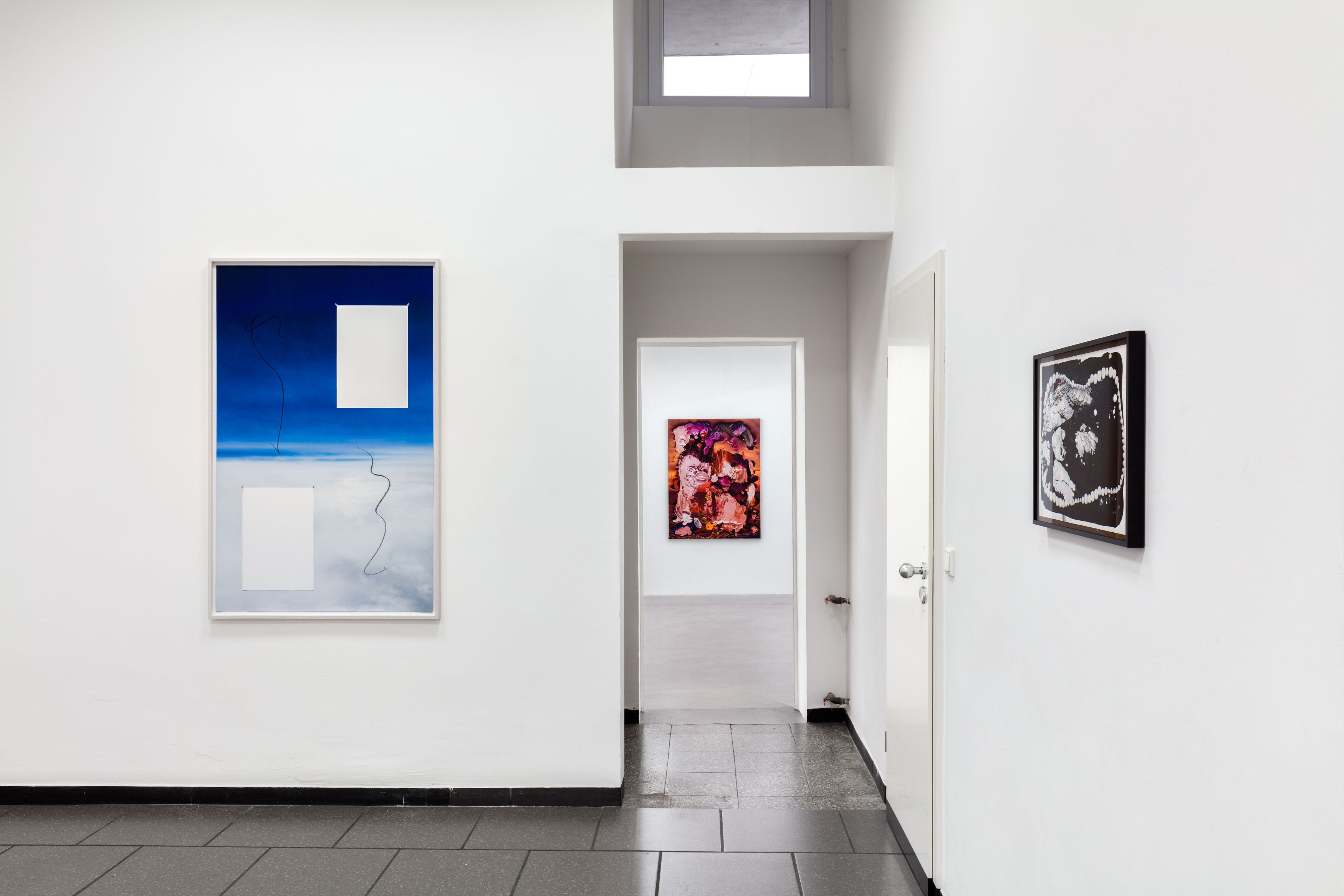
Another tricky one is Ohne Titel (Mond) (2025): A photographic mountain panorama at night. There’s no way the full moon can illuminate the snow-covered hills just as if it was daytime. But the moon isn’t real anyway - Johannes added a cheeky black fingerprint on its white smudgy surface. And neither is the pitch-black sky real. I can see the dust stuck to the black paint. But both the dust and the painted texture are an illusion. It’s all printed. I even doubt whether the mountains are photographed because I see a splash of white paint jumping out of a cliff like an explosion in the snow. And then, on the horizon between mountains and sky, I see a tiny slit revealing canvas underneath. Canvas? No. A printed image of a canvas. Johannes really makes sure to keep the confusion going. Even the fake canvas edges pretend to be smudged with rolling-down paint. And even the paper and its shadow are fake in Ohne Titel (Himmel) (2023).
Okay Silly Billy, got me there. From afar, these works look like paintings. Like real oil or acrylic or whatever on real textured canvas. I think it actually took me seeing six or seven works before catching on that it’s all entirely printed. Every time I was fooled I felt like a cartoon character who keeps on stepping on the dungfork, hitting their head over and over again with the stem.
Although these illusions are based on digital image editing, Johannes makes use of a century-old painting tradition: The Trompe-l'œil or Deception of the Eye. Trompe-l'œil painting arguably peaked in the 17th century, especially among Flemish artists. I mean The reverse of a framed painting (1670) by Cornelis Norbertus Gijsbrechts? Iconic! Or Jacobus Plasschaert faking a painting and etchings on a wooden surface within the painting in the 1650s? Chef’s kiss. They went crazy back in the day breaking that fourth wall. Johannes plays with similar illusions turning the artificial real. But the illusion is never complete, I don't get to fully indulge in the lie: He always adds a break, an irritation.
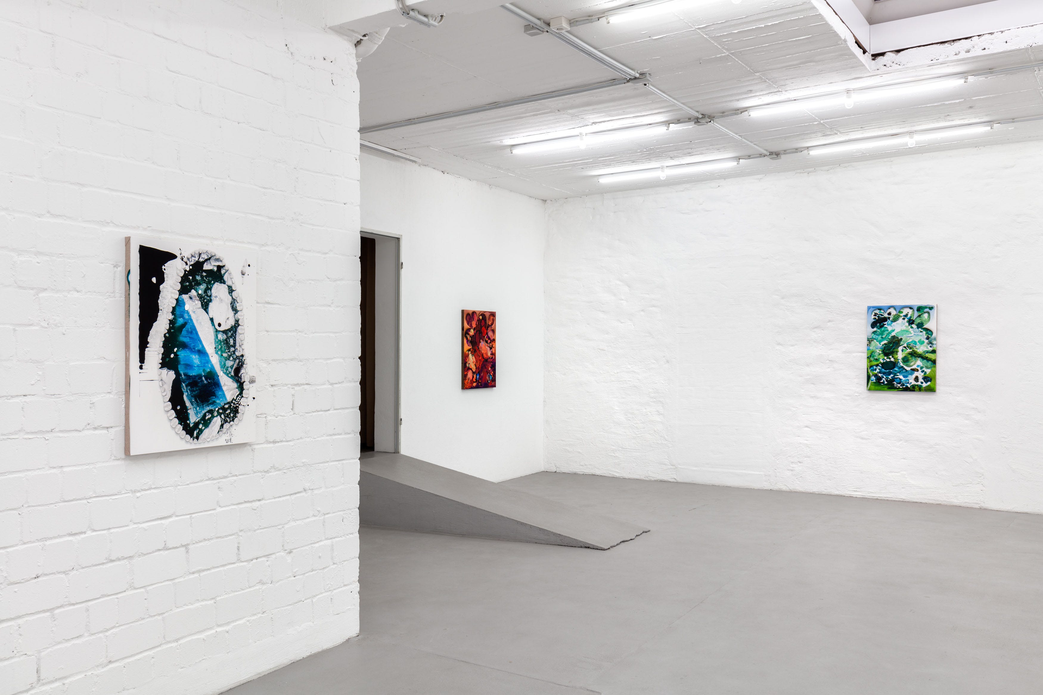
In the second room, the style differs in most works: Johannes rips open a photographic background to reveal a paint palette core (hence the exhibition title, probably). The color palette fits the base photographs. Johannes told me that he sources high-resolution images from providers like Shutterstock. Their impeccable quality contrasts the messy paint slobs. They are messy because Johannes samples real paint palettes from his painter friends. Enlarged, the surface stops looking like canvas. Instead, it’s giving ✨Oh! Raufasertapete!✨ Johannes then adds digital distortions that look like he accidentally ripped the space-time continuum. And at the same time, their edges are so uneven in some spots as if Johannes used scissors.
The photographed and painted spheres don’t stay separate, though. Palettenbild (Kuhwiese) (2025) is in one way an exception because the base image is a 3D image and not a photograph. There, it’s hard to draw the line between green paint and messy digital grass the cows are grazing on. Also, I am a hundred percent positive that the cow in the foreground can talk. That’s a Barnyard character for sure.
Another piece falling out of the usual pattern is an untitled one from 2025. It’s completely abstract, dominated by blue and pink lines squeezed straight out of the tube. Reminds me of kinetic sand. Green, orange, and yellow peek out in between, and so does the contradictory base: Some patches look like canvas, others are something horizontally striped else. Tiny cryptic letter and number combinations here and there are the file name of the underlying image, Johannes told me. An image that I can’t visually reconstruct. There’s only one tiny little detail that scratches my nerves: Johannes lined empty spots with shiny white teeth.
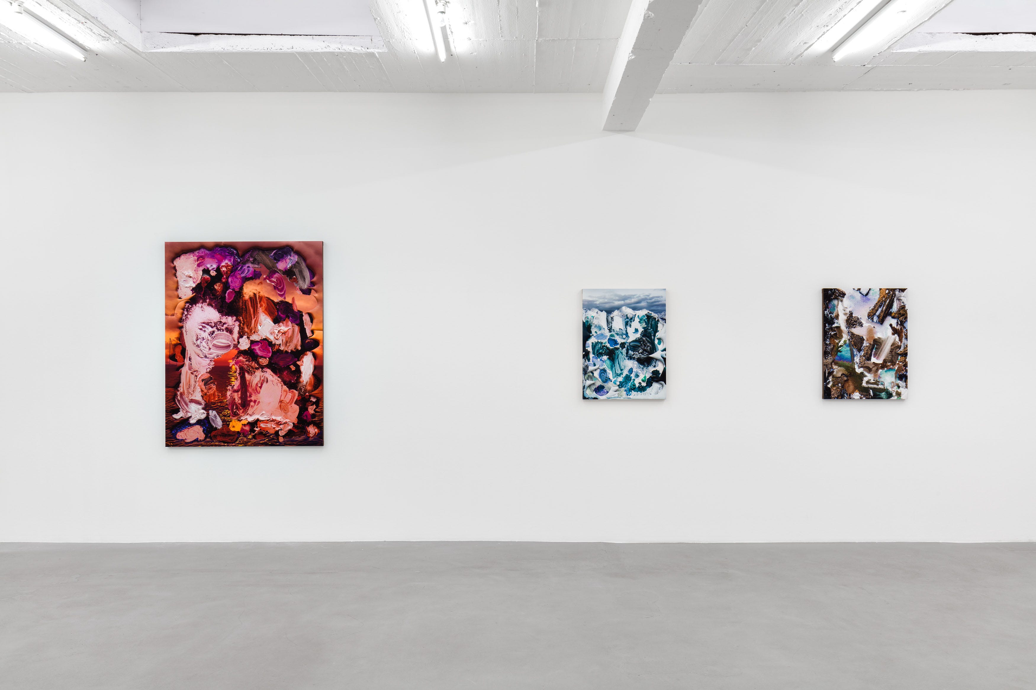
Teeth are a favorite gimmick of his. He did write an essay in German about his interest in them: I listened but I still didn’t hear him. Teeth used to dominate the visuals in his works a couple years ago, often as the center of a composition. Now they appear like little easter eggs here and there. In two works though, the perfectly shaped dreams of a tooth fairy encircle an icy landscape like a necklace, alternating between front and molar teeth (yeah, I had to google teeth terms for this one). The teeth feel like parasites in these works, adding irritation rather than intrigue. I can’t deny that I’m incredibly relieved he’s toning it down in the newer works.
The illusion game is not only about artistic tradition: In the end, the distinction between painting and print is one of prestige and economics. Paintings are always more in demand than prints on the market. People still associate art with brushes and canvases. They still value the implied uniqueness of a painted work. Johannes offers the best of both worlds, even though these works remain prints. Do you care? Or are you like Janine in He’s Just Not That Into You (2009) who insists on real wood floor even though she can’t tell the difference with vinyl?
Johannes Bendzulla: Palettenbilder, through March 15, 2025, at Petra Rinck Galerie.
Petra Rinck Galerie
Birkenstraße 45
40233 Düsseldorf
Website
Instagram: @petrarinckgalerie @johannesbendzulla
Heyyy, don’t forget to subscribe! Love y’all!
See you soon!!!
Jennifer
The Gen Z Art Critic
Great analysis